The Challenge
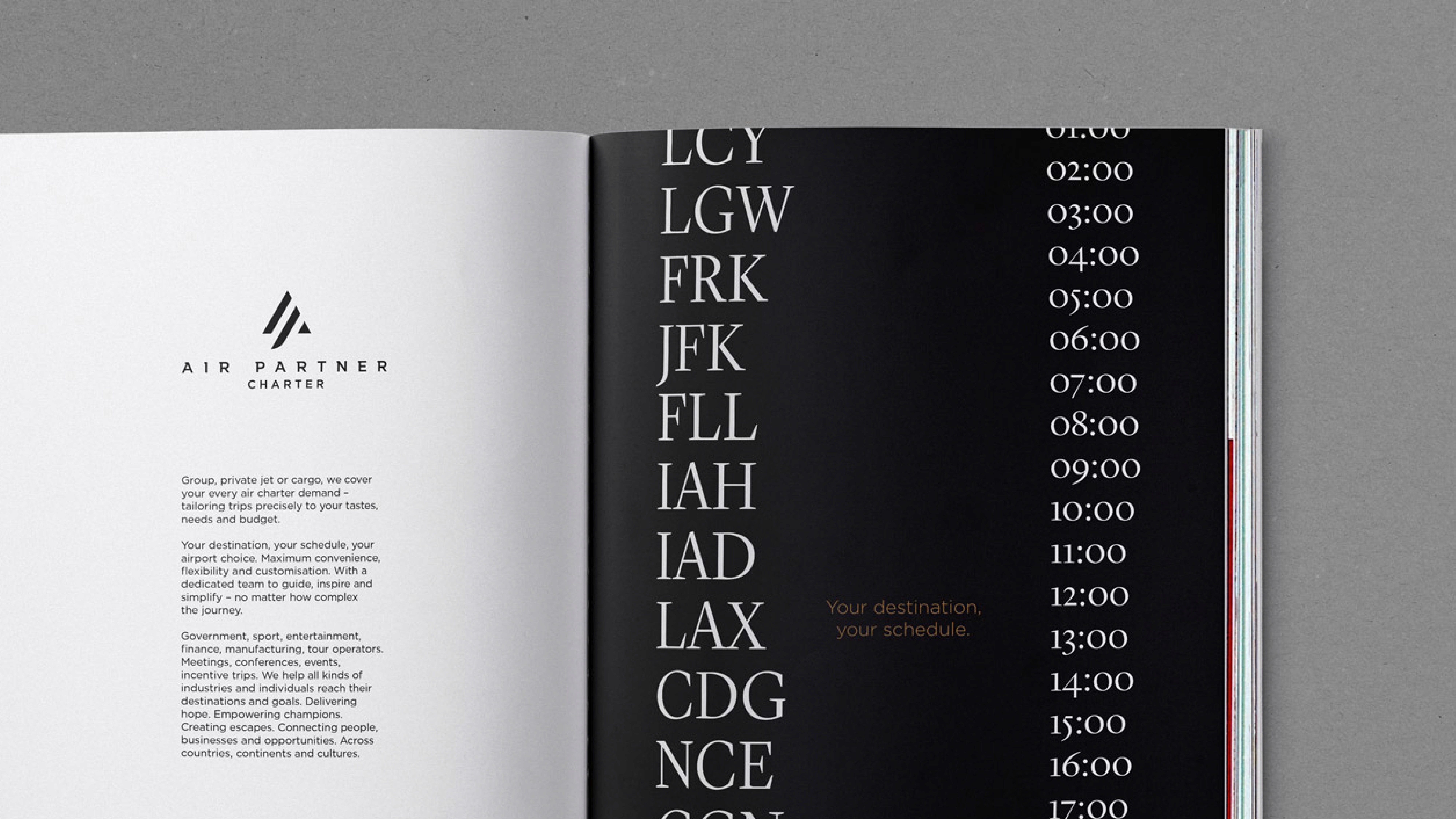
Air Partner PLC had grown rapidly, bringing together multiple companies with individual brands, naming structures, heritage and cultures. Operating around the world, including areas where flights can mean the difference between life or death – extracting people or delivering medicine – the brand repositioning aims to drive Air Partner’s internal culture and customer experience, enabling it to stand out within the highly competitive aviation industry.
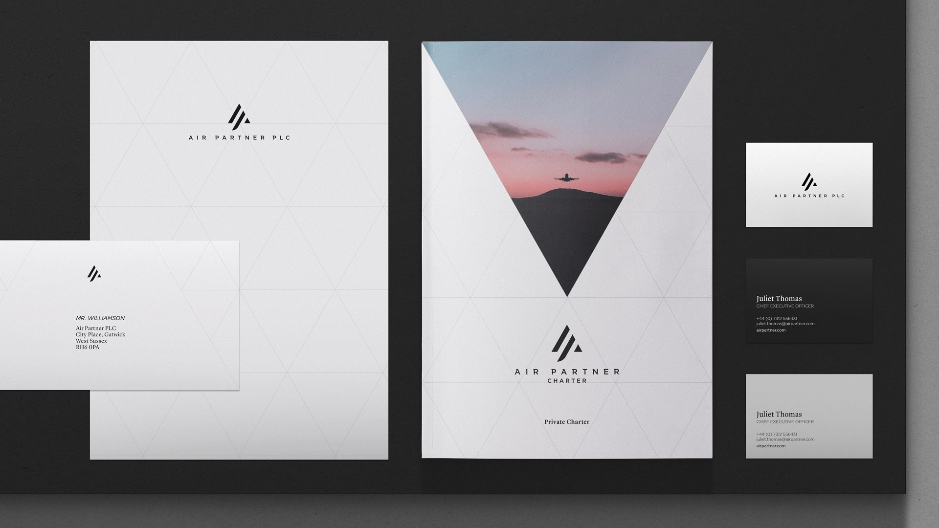
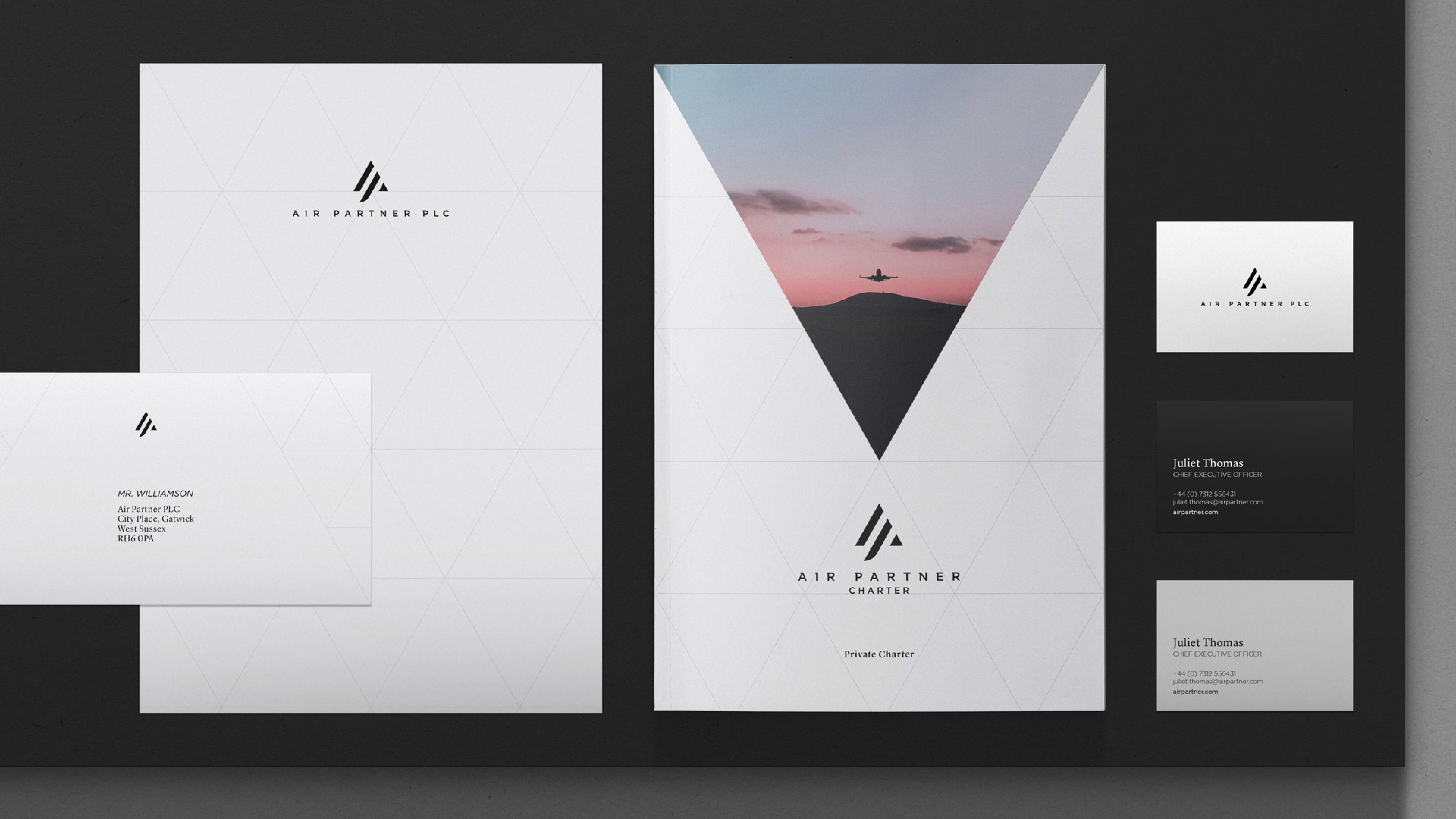
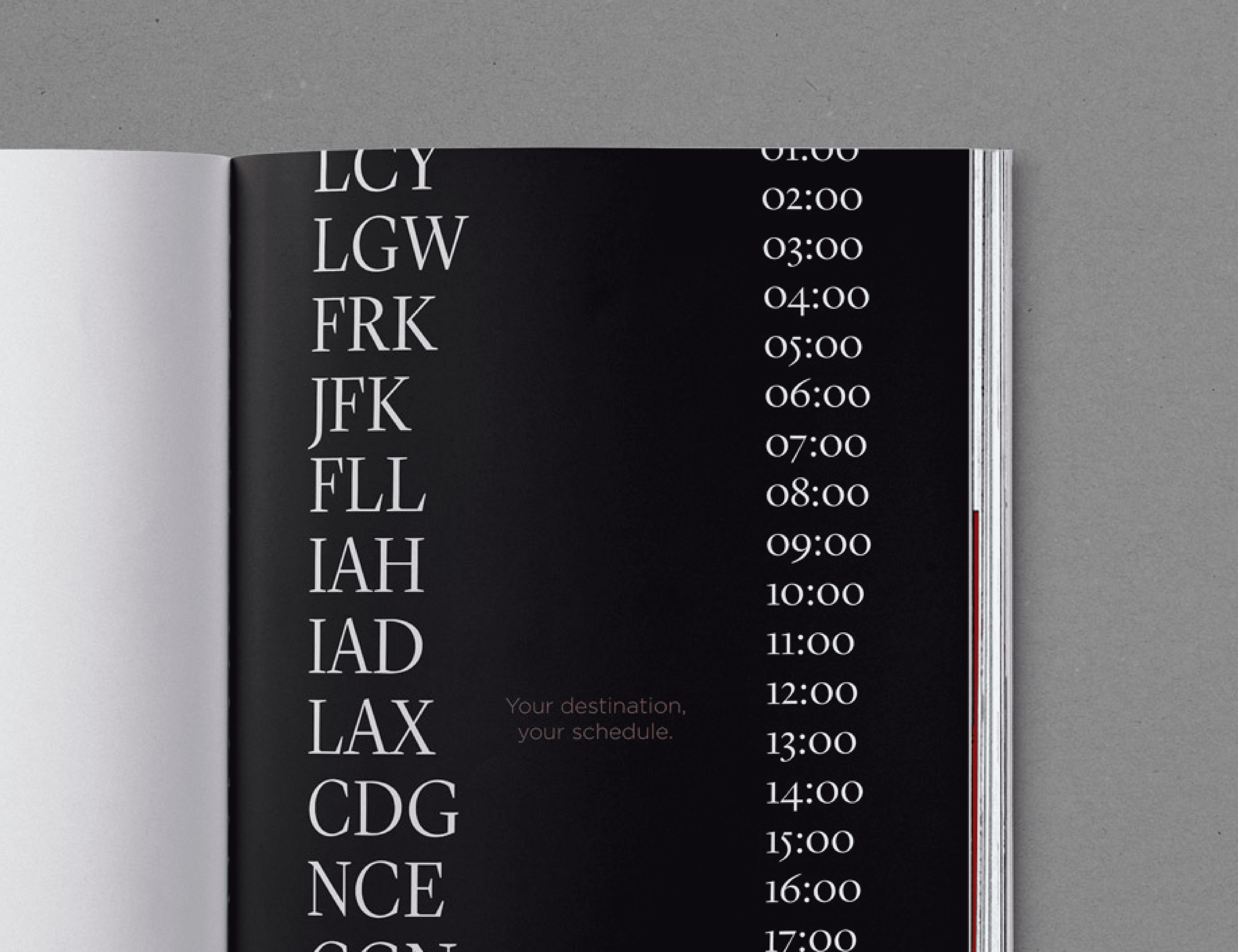
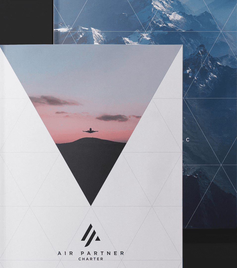
The creative concept modernises the Air Partner brand significantly whilst celebrating both its heritage and customer focus. Anchored by a graphic language of triangles, the identity references flying formations evoking a ‘stronger together’ ethos of shared goals throughout the business.
The Challenge
SThree’s fragmented brand structure and siloed sub-brands diluted its ambition. We repositioned the company with a bold strategy, unifying the architecture while preserving sub-brand expertise. Moving to a unified endorsement model, we elevated SThree from a STEM recruitment leader to a distinct category of its own—creating a consistent, future-ready brand that reinforces leadership, showcases full industry depth, and sets it apart from competitors.
Services
Brand Idenity
Motion Design
Hero imagery to outpace tomorrow
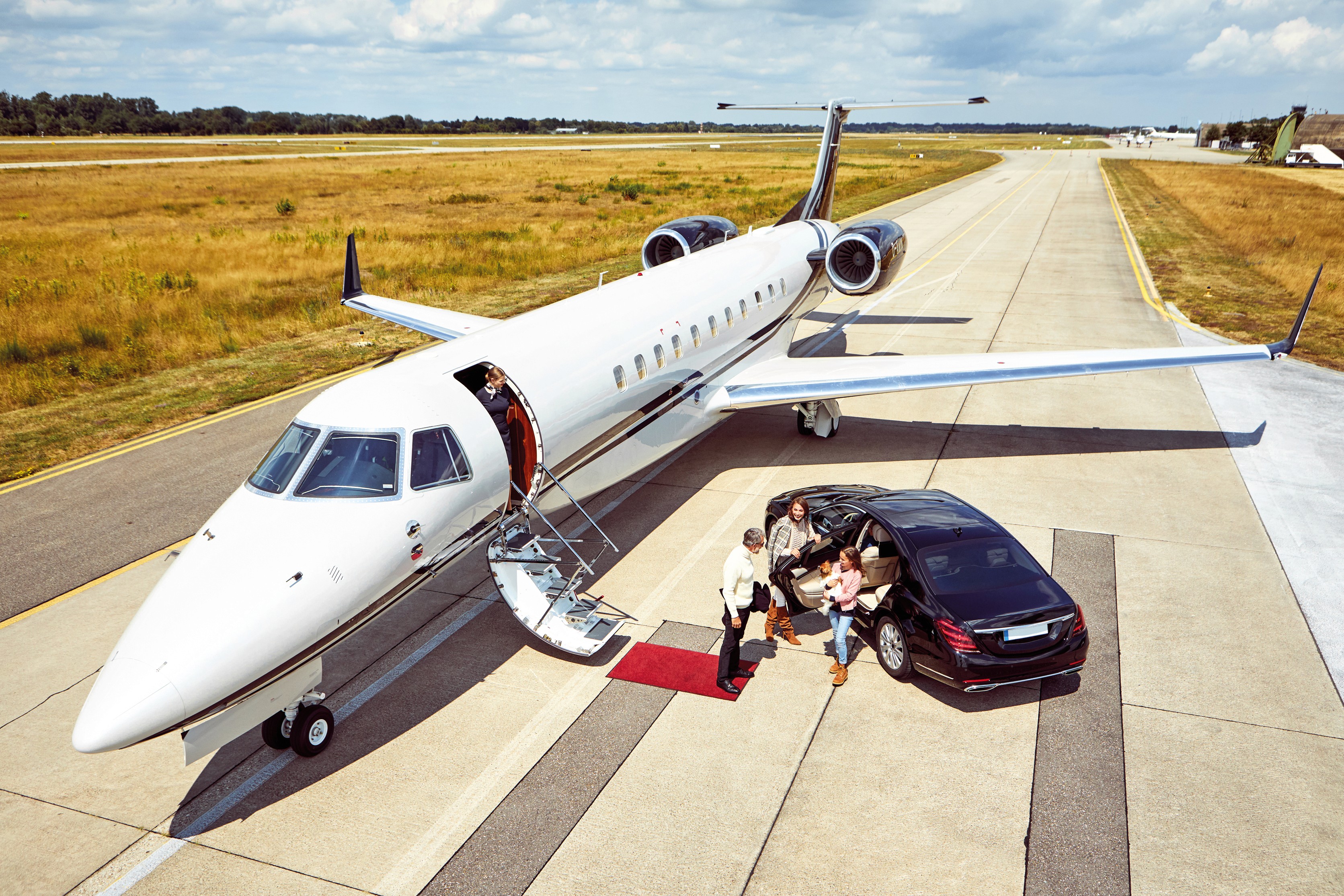
Capturing a world of flight that never sleeps
The Ident distills the core thought of flying togetherness through formation at the the same time as introducing the identitys strong brand system and sense of direction. The colour palette borrows from the changing narrative of the sky from sunrise to sunset and commissioned photography to traverse geographies, time zones and subject matter to capture a world of flight that never sleeps, both on the ground and above it.

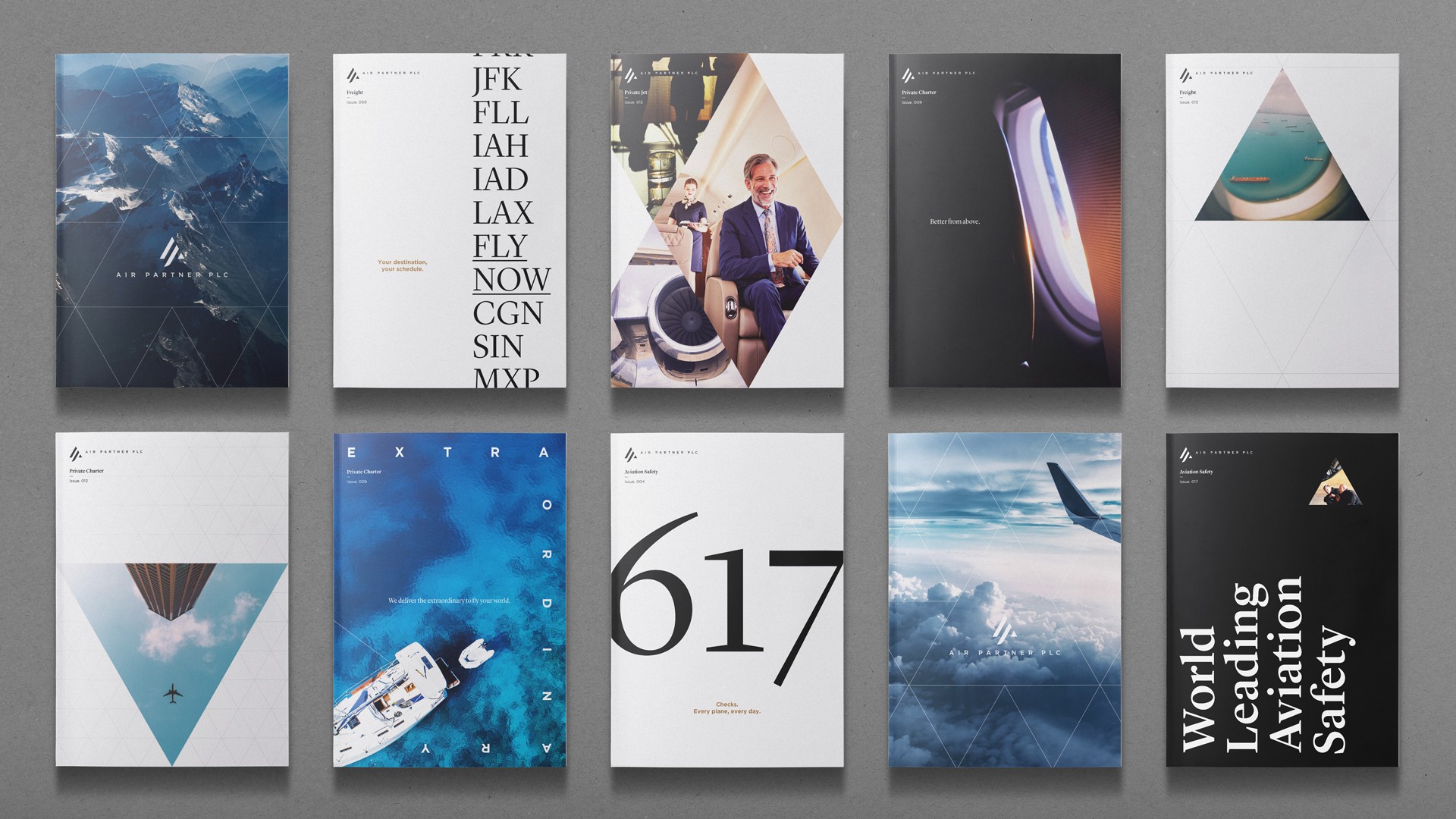
A modular approach to imagery
Capturing a world of flight that never sleeps
This concept of timelessness was further explored through motion. Large crops of the logo mark were used as visual windows, seamlessly manipulating their surroundings—delaying time and interactions in a way that felt both effortless and elegant. This approach enabled the brand to take ownership of aerial footage and stunning establishing shots, creating a distinct, beautifully minimal aesthetic.
The Ident distills the core thought of flying togetherness through formation at the the same time as introducing the identitys strong brand system and sense of direction. The colour palette borrows from the changing narrative of the sky from sunrise to sunset and commissioned photography to traverse geographies, time zones and subject matter to capture a world of flight that never sleeps, both on the ground and above it.
This concept of timelessness was further explored through motion. Large crops of the logo mark were used as visual windows, seamlessly manipulating their surroundings—delaying time and interactions in a way that felt both effortless and elegant. This approach enabled the brand to take ownership of aerial footage and stunning establishing shots, creating a distinct, beautifully minimal aesthetic.
Credits
Studio
StormBrands 2019-20
Creative Dir
Mark Chatelier
My Role
Snr Designer
Identity and Motion Design


